CIIT GmbH's mediation software has a new feature. Case workers, mediators, and other users can now visualize their own data in the OmbuDesk report dashboard with just a few clicks.
How does the report dashboard work?
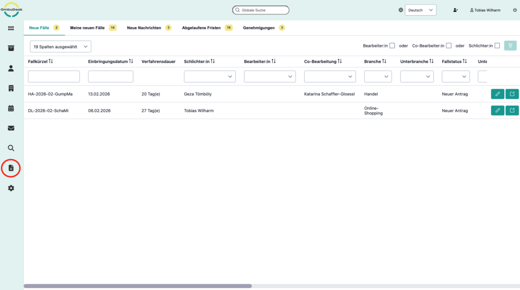
OmbuDesk's report dashboard is based on filter and criteria search. The OmbuDesk development team noticed that mediation and ombudsman offices frequently use filters and criteria searches. This usage is now paying off in two ways:
In the future, all users, clerks and mediators of OmbuDesk will be able to visualize these searches with just a few clicks and save the resulting graphics or diagrams.
How do users create new charts in the report dashboard?
If you use OmbuDesk, you can easily benefit from the new feature. If the feature has already been integrated for your mediation or ombudsman's office, you will find the report dashboard in the left-hand menu under "Reports".
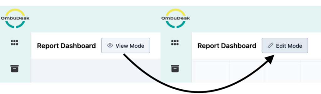
Here's how to switch to edit mode in the report dashboard
If you navigate to the OmbuDesk report dashboard using the highlighted button, you will see an empty area when you first open the new tab.
In the upper left corner of the application, next to "Report Dashboard," there is a button labeled "View Mode." Clicking this button switches you to Edit Mode, allowing you to customize the report dashboard to your liking.
What data can you visualize in the report dashboard?
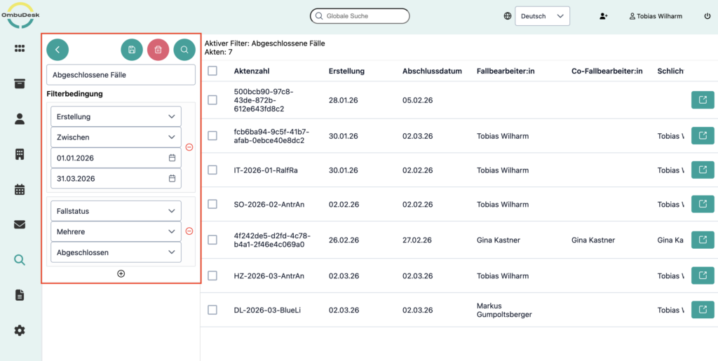
In general, you can visualize all search results that you have saved in the filter or criteria search.
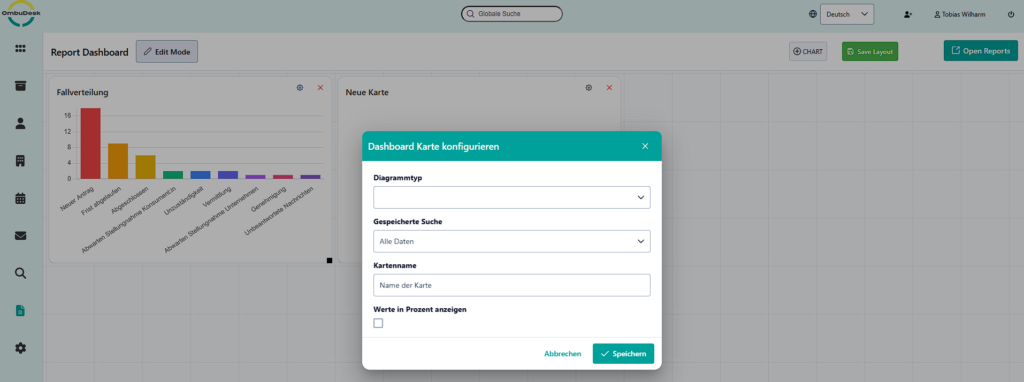
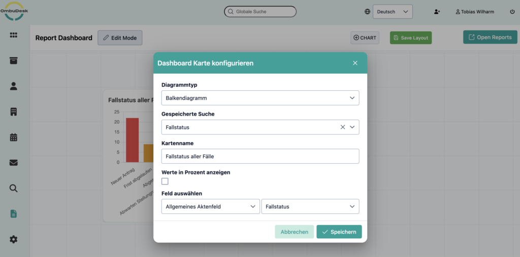
If you click on the button „"Chart"“ Drag a new graphic/chart into the report dashboard on the right-hand side, then in the next step you will be asked…
… which Form of presentation You wish which Search as a data basis and whether you relate the data to a further file field want to set.
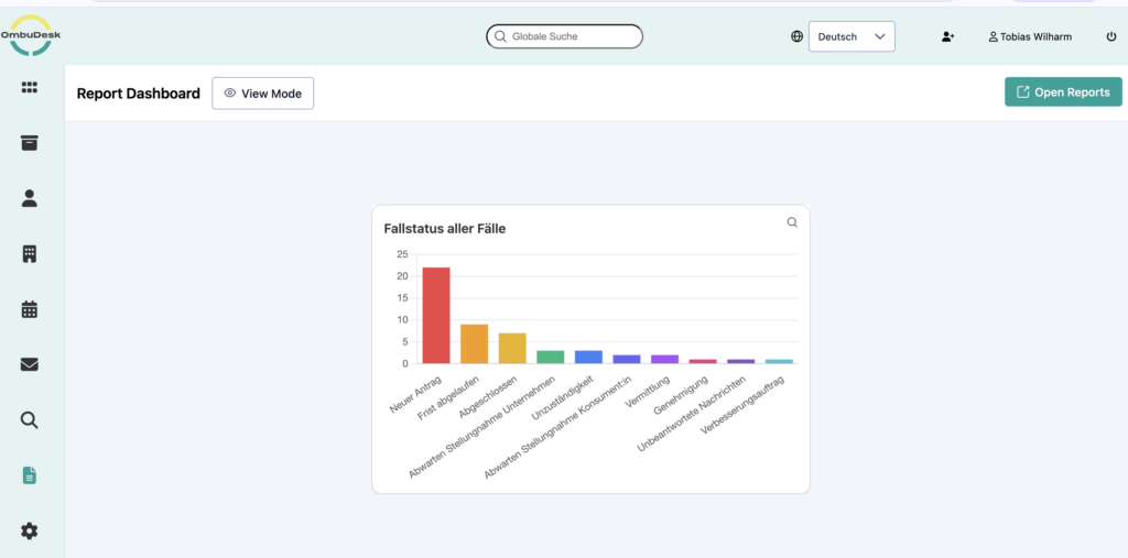
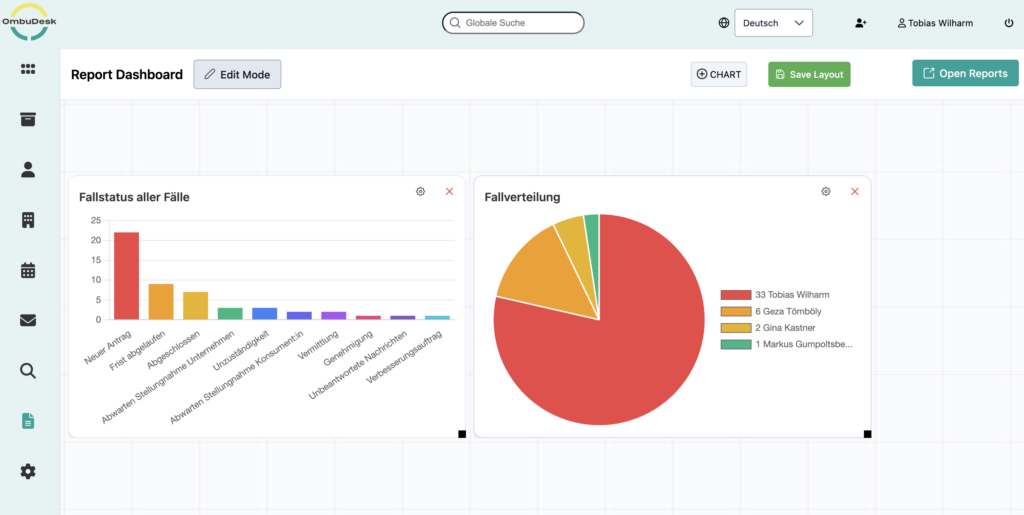
Example 1: Visualization of all the statuses of your cases
One useful application of OmbuDesk's new dashboard report function is, for example, the visualization of all your case statuses. This allows you to see the current status of your case processing at a glance.
To do this, first create a search that all cases includes and the Case status:
Tip: You can easily do this by filtering by case status and selecting all statuses.
Use this search in the second step as Data basis for a chart in the new report dashboard:
Here is the result:
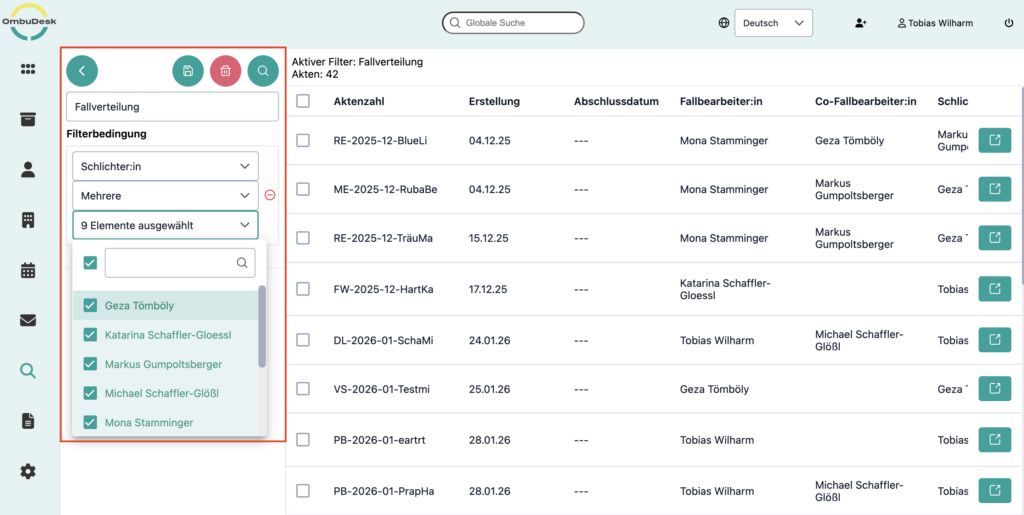
Example 2: Visualization of the case distribution per mediator or case worker
You're probably not only interested in the status of all your cases. For example, we think another exciting use for the new report dashboard is workload distribution. How are all the cases distributed among your case workers and mediators?
If you are interested in this answer, then as a first step, create a search where you search for Mediator: or Editor: Search and select all available colleagues:
Use this search again as Data basis for diagram creation:
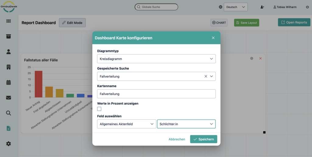
A pie chart is well suited here to visualize the case distribution:
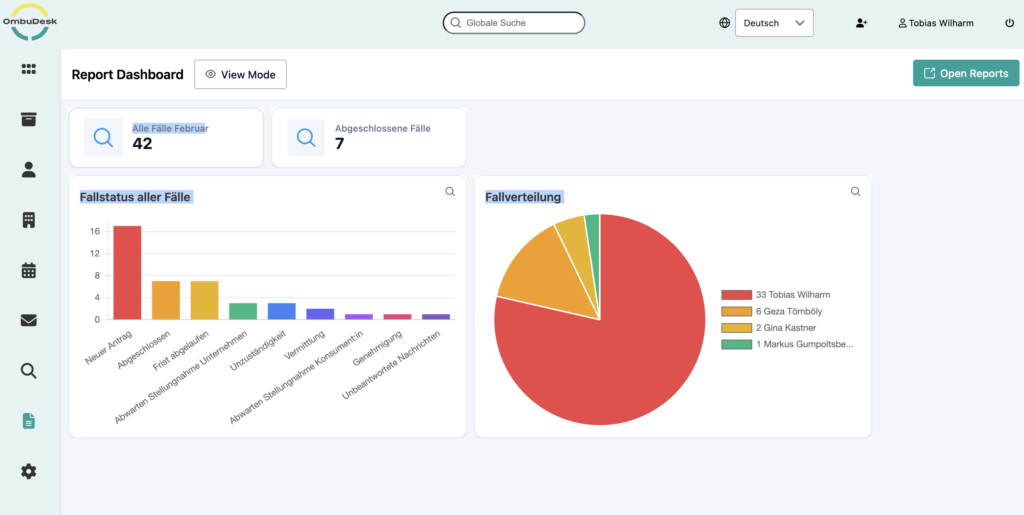
Example 3: Individual values that are statistically relevant as key figures
In the previous examples, we always linked different data points together. Sometimes, however, a single value is sufficient to meaningfully visualize the current state of your arbitration board.
For example, how many applications have you received this month? Or how many cases have you closed this year? Both answers begin with a similar filter search:

If you are filtering by cases per month, it is sufficient to limit the creation period.
And for all cases closed over a certain period of time, simply add the case status "Closed".
And this is how you get meaningful individual values for your report dashboard:
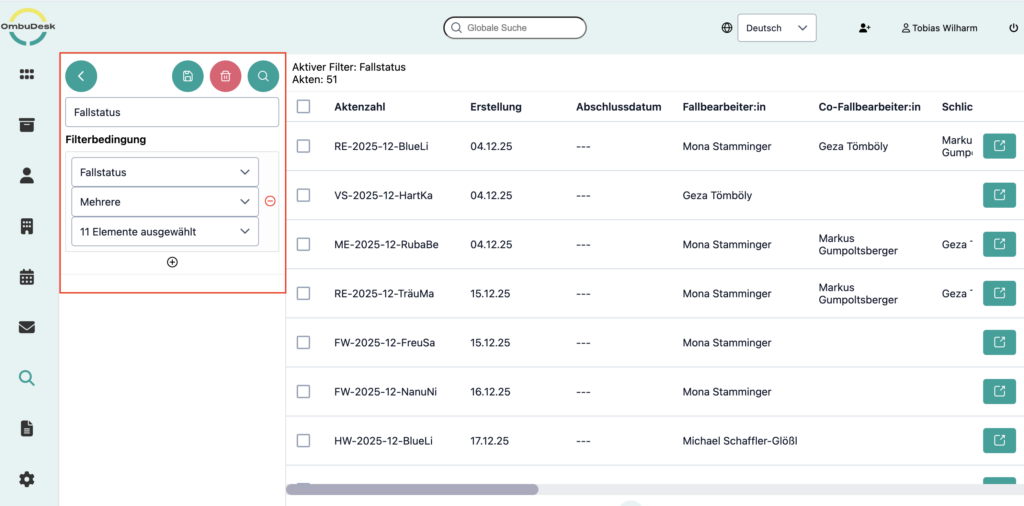
Navigate directly from the report dashboard to a linked search.
The report dashboard isn't just visually appealing. On the one hand, it allows you to quickly gain an overview of all the key performance indicators in your conciliation or ombudsman's office, and on the other hand, you can switch from the graphic to the linked search function with just one click.
Here's how to use the charts in the report dashboard as quick access to your most important searches:
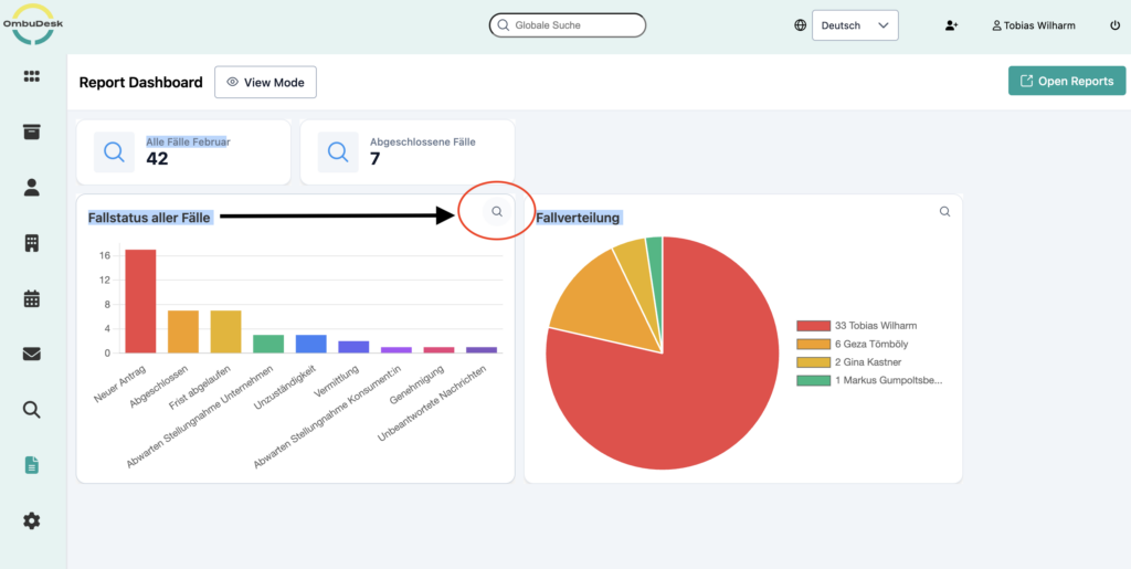
With just one click on the magnifying glass icon next to any graphic or diagram, you will land in the search function:

What benefits will you gain from the new feature?
- Keep an eye on your KPIs at all times.
Easily visualize any key performance indicator (KPI) that is important to you – using criteria search and automatic visual presentation.
- Identify trends in your data early on.
See at a glance how your key performance indicators change in the short, medium and long term, and take appropriate action.
- Make reporting easier for yourself
Use graphics from your mediation tool to simplify report creation.
What's next for OmbuDesk?
The developers of OmbuDesk and the technical management Michael Schaffler Glößl We are constantly working to further improve the dispute resolution tool. We will also keep you informed about updates in the future. CIIT Blog, so that you are always well informed about the progress of the solution.